Category: Conventional Wisdom Under the Lens
"Support and Resistance" — What You're Actually Saying
When you draw a line on a chart and call it support, you're making a specific mechanical claim. You probably haven't thought about it that way. You should — because the assumption hiding inside that label is exactly where most trading analysis goes wrong.
Every trader draws these lines. You learn it in week one. Price bounced here before, so you mark it. Price stalled there, so you mark that too. You end up with a chart full of horizontal lines and a feeling that you understand the market.
I'm not going to tell you those lines are useless. But I want to show you what you're actually claiming when you draw one — and why that claim is far less certain than the confident horizontal line makes it look.
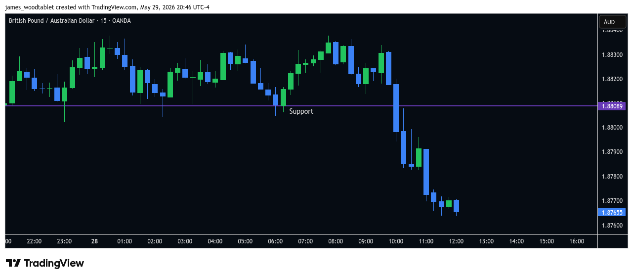
The claim inside the label
When you draw a support level and watch price approach it, you are — whether you've articulated it or not — making this claim: buy-side liquidity sitting at that price will be sufficient to absorb the sell aggression arriving there.
That's the whole bet. Nothing more, nothing less.
Buy-side liquidity means resting limit buy orders — participants who have placed orders at that price and are waiting to be filled. When sell aggression arrives (market orders demanding to sell right now), those resting buy orders absorb it. If there are enough of them, price doesn't move through the area. If there aren't — either because they've been consumed, withdrawn, or simply overwhelmed — price relocates lower.
The label "support" makes this sound like a property of the price level itself. It isn't. It's a property of the orders sitting at that level, right now, in this moment. And those orders are invisible to you.
"Support" sounds like something the chart has. What it actually describes is something the order book has — and the order book is not on your chart.
Where the assumption breaks
Here's the thing that makes support analysis unreliable as a category: a level can look identical before it holds and before it breaks. The chart gives you the same picture in both cases — price approaching a horizontal line — and the outcome is determined entirely by what's happening in the order book underneath it.
A level holds when buy-side liquidity absorbs the arriving sell aggression. It breaks for one of three reasons: the liquidity was consumed by prior visits (each time price tested the level, some of those resting orders were filled and not replaced), the liquidity was withdrawn (the participants who placed those orders changed their minds and cancelled), or the arriving sell aggression was simply larger than the liquidity available to absorb it.
All three produce the same event on your chart: the level breaks. And none of the three are visible to you before they happen.
This is why the phrase "the level is getting weaker each time it's tested" contains a half-truth. Sometimes that's accurate — repeated visits do consume liquidity. But sometimes a level breaks on the first visit because the liquidity was thin to begin with. And sometimes a level holds through a dozen visits because it's being continuously restocked by participants who want to be long at that price. The number of prior tests tells you about prior history. It tells you nothing about the current order book.
Why the word "strong" makes it worse
Add the word "strong" — "strong support," "major support," "key level" — and the problem compounds. Now you're not just making a claim about current liquidity. You're implying that the liquidity is substantial and persistent. That it has some obligation to hold.
It doesn't.
A level that has held ten times is a level where buy-side liquidity has absorbed sell aggression ten times in the past. That's all you know from the chart. Whether that liquidity is present now, in sufficient quantity, is a question the chart can't answer before the fact.
"Strong support" is a retrospective judgment dressed as a forward-looking description. The word "strong" is doing work that your chart data cannot support.
The reframe in practice:
Instead of: "Price is approaching strong support at 1.0850."
Try: "Sell aggression is arriving at an area with prior buy-side liquidity. Watching to see if it's absorbed or if price relocates through."
Notice what changes. The first sentence implies an expected outcome. The second names an ongoing process and waits for information. The first makes you a predictor. The second makes you an observer.
That shift — from prediction to observation — is not a small philosophical distinction. It changes what you're looking for when price gets to that level. Instead of watching for "confirmation" that your support is holding, you're watching the actual interaction: is sell aggression arriving? Is it being absorbed? Is price relocating? Are the candles stacking lower, or are they finding absorption and closing back up?
The observational question gets answered by the chart in real time. The predictive question just waits for the market to agree or disagree with your label.
The same logic applies to resistance
Everything above runs in reverse for resistance. When you draw a resistance level, you're claiming sell-side liquidity sitting at that price will absorb arriving buy aggression. The same invisibility problem applies. The same three failure modes exist. The same retrospective-dressed-as-forward issue with the word "strong."
Resistance holds when sell-side liquidity (resting limit sell orders) absorbs buy aggression. It breaks when that liquidity is consumed, withdrawn, or overwhelmed. The level has no memory of having held before. No obligation to hold again.
The chart is a record of past interactions between aggression and liquidity at various prices. It is not a map of future obligations.
None of this means you should stop watching price levels. Where aggression has previously met liquidity is genuinely useful information — it tells you where participants have historically been willing to trade, which increases the probability that orders are clustered there. Obvious levels tend to attract order flow.
What changes is how you hold that information. Not as a prediction ("this will hold"), but as a question ("is it holding?"). Not as a label with a fixed meaning, but as an area to watch for information as the interaction unfolds.
The chart tells you what happened. It doesn't tell you what will happen. That's not a limitation of this framework — that's the honest description of what a chart is.
The book walks through exactly how to turn that kind of observation — watching aggression meet liquidity at a level in real time — into a structured read of what the market is currently doing, and from there into a complete decision framework. That next step, from accurate observation to tradeable structure, is what it covers.
This material is provided for educational purposes only and is not financial advice. Trading forex involves substantial risk of loss. Past performance is not indicative of future results. Always conduct your own research and consult with a qualified financial professional before making any trading decisions.